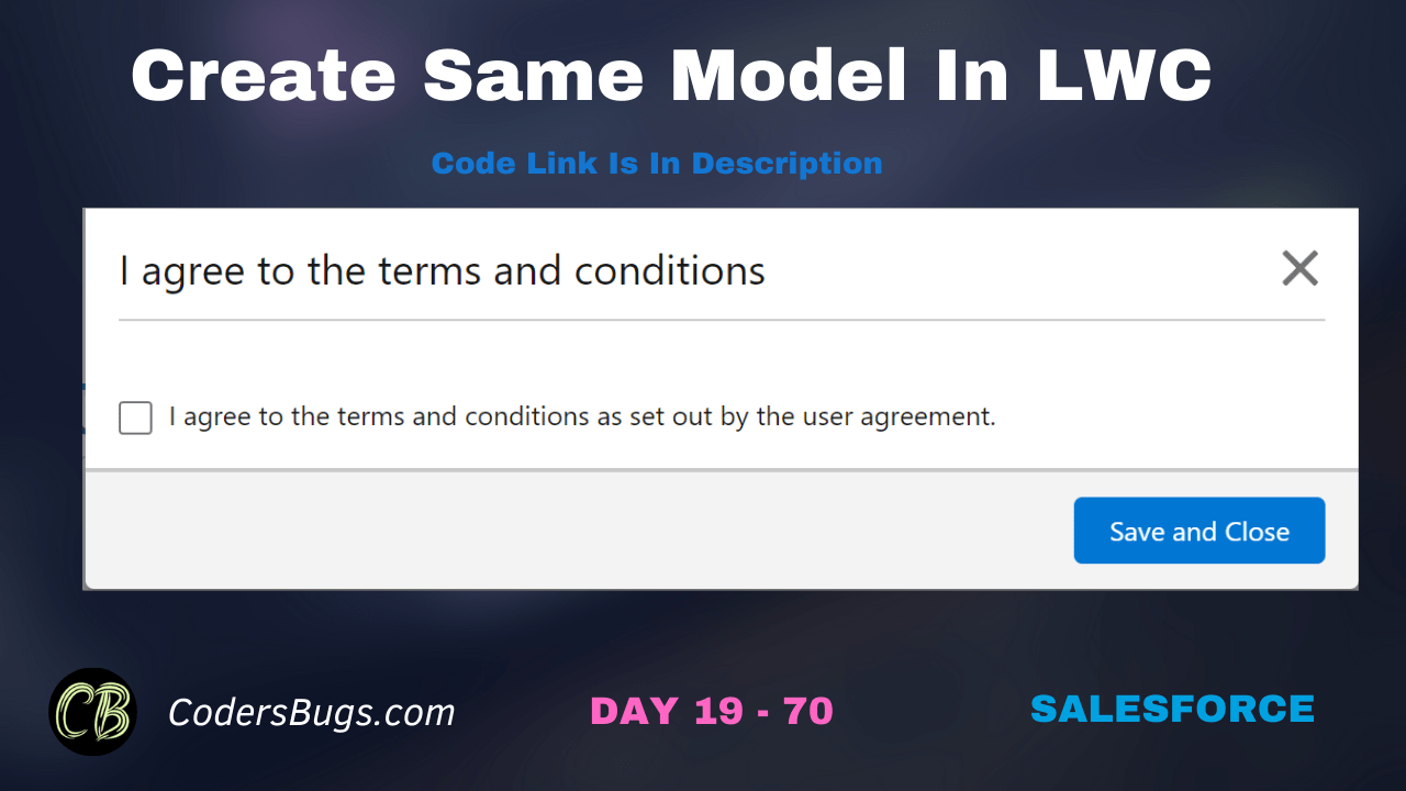
Find the code here to create LWC model with cross icon inside it.
HTML File
					<template>
    <lightning-button onclick={openLightningModel} label="Open Model"></lightning-button>
    <div if:true={showPopup}>
        <section role="dialog" tabindex="-1" aria-modal="true" aria-labelledby="modal-heading-01" class="slds-modal slds-fade-in-open slds-modal_small">
           <div class="slds-modal__container">
              <div class="slds-modal__content slds-p-around_medium">
                <header class="slds-card__header slds-grid">
                    <div class="slds-media slds-media_center slds-has-flexi-truncate">
                        <div class="slds-media__body">
                            <span class="slds-modal__title slds-hyphenate">I agree to the terms and conditions</span>
                        </div>
                        <div class="slds-no-flex">
                            <lightning-icon icon-name="utility:close" size="small" alternative-text="close" title="close" onclick={closeLightningModel}></lightning-icon>
                        </div>
                    </div>
                </header>
                <hr style="width: 100%; margin-top: 10px; height:3px;" />
                <fieldset class="slds-form-element">
                    <div class="slds-form-element__control">
                        <div class="slds-checkbox">
                            <input type="checkbox" />
                            <label class="slds-checkbox__label">
                                <span class="slds-checkbox_faux"></span>
                                <span>I agree to the terms and conditions as set out by the user agreement.</span>
                            </label>
                        </div>
                    </div>
                </fieldset>
              </div>
              <div class="slds-modal__footer">
                 <lightning-button label="Save and Close" variant="brand" onclick={saveAndClose}></lightning-button>
              </div>
           </div>
        </section>
        <div class="slds-backdrop slds-backdrop_open" role="presentation"></div>
     </div>
</template>
JS File
					import { LightningElement, track } from 'lwc';

export default class ModelWithCross extends LightningElement {
    @track showPopup = false;

    openLightningModel() {
        this.showPopup = true;
    }

    closeLightningModel() {
        this.showPopup = false;
    }

    saveAndClose() {
        this.showPopup = false;
    }
}
In this video we have demonstrated and explain the code.
How the modal works
The component keeps one flag, showPopup. When it is true, the template shows the modal and the dark backdrop. openLightningModel sets it to true, and closeLightningModel and saveAndClose set it back to false. The cross icon in the header calls the close method.
A complete accessible template
<template>
    <lightning-button label="Open Modal" onclick={openLightningModel}></lightning-button>
    <template if:true={showPopup}>
        <section role="dialog" tabindex="-1" aria-modal="true" aria-labelledby="modal-heading" class="slds-modal slds-fade-in-open">
            <div class="slds-modal__container">
                <header class="slds-modal__header">
                    <lightning-button-icon class="slds-modal__close" icon-name="utility:close" variant="bare-inverse" alternative-text="Close" onclick={closeLightningModel}></lightning-button-icon>
                    <h2 id="modal-heading" class="slds-modal__title slds-hyphenate">Terms and conditions</h2>
                </header>
                <div class="slds-modal__content slds-p-around_medium">
                    I agree to the terms and conditions as set out by the user agreement.
                </div>
                <footer class="slds-modal__footer">
                    <lightning-button label="Cancel" onclick={closeLightningModel}></lightning-button>
                    <lightning-button variant="brand" label="Save" class="slds-m-left_x-small" onclick={saveAndClose}></lightning-button>
                </footer>
            </div>
        </section>
        <div class="slds-backdrop slds-backdrop_open"></div>
    </template>
</template>
The role, aria-modal and aria-labelledby attributes help screen readers. The alternative-text on the close icon gives the button a name.
Points to note
@trackis not needed for a true or false value.- Salesforce also offers the
LightningModalbase class, which gives you a ready modal with focus handling. It is worth using in new components.
FAQ
How do I close the modal with the Escape key?
Listen for the keydown event on the section and call the close method when the key is Escape.
Why is there a backdrop element?
It darkens the page behind the modal and shows the user that the page is locked.